The best TikTok subtitle styles in 2026 are boring on purpose: bold high-contrast text, two lines max, safe-zone placement, light motion. We tested on real Shorts — rainbow kinetic captions looked cool in the editor and tanked subtitle retention in the feed. Workflow: transcript → SRT → one template → hook rewrite. Speed tips: why tools feel slow; tool picks: generator roundup.
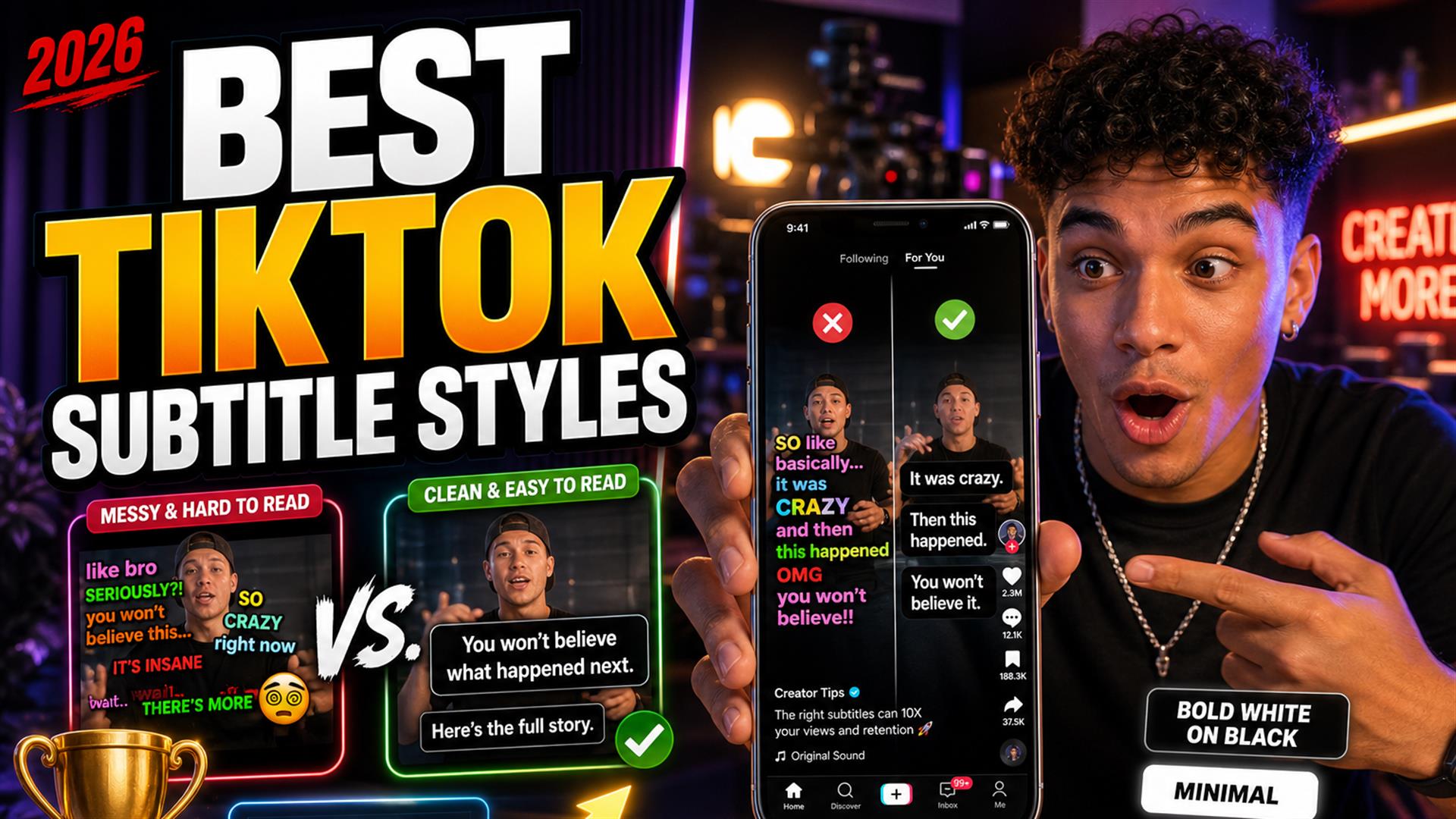
Subtitles aren’t optional on TikTok, Reels, or Shorts anymore — they’re the first thing muted viewers read. Every creator I know has tried the flashy template: word pop, color cycle, emoji confetti. It screenshots great. Then you post, watch retention dip, and realize your audience wasn’t admiring the typography — they were trying to parse it before the scroll won.
We tested this on real Shorts across talking-head, podcast clips, edu, gaming, and lifestyle. Same hooks, different subtitle design for Shorts styles. This is what improved readability, what hurt watch time, and the clean subtitle styles that surprised us by winning.
Fair warning: we’re not designers flexing typography degrees. We’re editors who got tired of re-exporting because the “viral” template buried the hook. If you want permission to keep captions simple, you have it here.
We Tested Subtitle Styles Across Real Shorts
Not mockups — posted variants, compared completion and rewatches where analytics allowed, plus blind phone tests (arm’s length, 40% brightness, café glare).
- Talking-head — finance, fitness, hot takes.
- Podcast clips — two faces, fast banter.
- Educational — lists, screen inserts, diagrams.
- Gaming — HUD clutter, facecam corner.
- Lifestyle / vlog — movement, outdoor light.
- Interview clips — names, lower-thirds, overlapping speech.
Mobile viewing rules everything: thumbs cover edges, TikTok UI eats the bottom, people scroll in bed with brightness low. A style that pops on a 27" monitor became unreadable instantly on a six-inch screen in a dark room.
We A/B’d three styles on the same hook for a finance Short: clean white bar won on average watch time; kinetic rainbow looked “premium” in CapCut and underperformed the control. Not a lab — real posts, same account, same weeknight audience.
Why Most Subtitle Styles Fail
Creators overdo this constantly: more color, more motion, more font changes — as if variety equals quality. Cool-looking often becomes unreadable.
- Too many colors — rainbow words fight the video, not support it.
- Over-animation — bounce, spin, scale on every word; eyes can’t rest.
- Tiny text — fine on desktop preview, gone on phone.
- Emoji overload — 🔥 between every word reads as spam.
- Bad positioning — captions on chins, eyes, or the product you’re selling.
- Excessive movement — lines jumping vertical position clip to clip.
This style looked cool but hurt readability: neon outline, no fill, on a bright outdoor vlog. The words literally disappeared against sky. Retention wasn’t “slightly down” — it was obviously worse in side-by-side tests.
The Subtitle Styles That Actually Improved Retention
Simple subtitles performed better than expected. The winners shared traits:
- Bold readable text — sans-serif, heavy weight, large size.
- Clean shadow or background — semi-transparent bar or tight drop shadow, not both fighting each other.
- Safe-zone positioning — lower-middle, above TikTok chrome; see Shorts safe zones (same geometry as TikTok 9:16).
- Consistent animation — one highlight style per channel, not per clip.
- Sentence pacing — lines match breath groups, not arbitrary 3-word chunks.
- High contrast — white/yellow on dark bar, or black on white bar — pick one system.
Word-by-word highlight (single active word emphasized) worked when subtle — not when every syllable zoomed. The best captions for TikTok felt like signage, not a music visualizer.
Retention note: Readable beats pretty on muted traffic. Fancy edits don’t rescue a hook viewers can’t parse in one second.
The Biggest TikTok Caption Mistakes in 2026
Authentic mistakes we still see daily (and made ourselves):
- Subtitles jumping around — different Y position every line; feels broken.
- Words appearing too fast — kinetic templates outpacing speech.
- Excessive zoom animations — motion sickness in a 30-second clip.
- Too low / too high — under the like button or under the chin.
- Unreadable fonts — thin script, heavy serif, micro ALL CAPS blocks.
- Over-styled captions — stroke + glow + gradient + emoji + bounce.
Template marketplaces sell “viral” styles. Platforms sell reach to viewers who scroll fast, watch muted, and consume quickly. Clarity matters more than effects — our clean subtitles & watch time piece goes deeper on why.
Fonts and Colors That Survived the Feed
Winners were boring: Montserrat Bold, Arial Black, or CapCut’s default heavy sans — always with a fill, not outline-only. Color pairs that worked: white on ~70% black bar, yellow on black, black on white bar. Losers: pastel pink on yellow, red on orange, any gradient behind moving video without a bar.
Subtitle readability isn’t a taste debate — it’s contrast math at phone size. If you wouldn’t put that combo on a highway sign, don’t put it on a hook.
What Worked Best for Different Types of Creators
Podcasters
Two speakers, overlapping laughs — use a stable bar, don’t animate speaker changes with color explosions. Name lower-thirds separate from captions; keep readable captions on the active speaker’s chest level, not across both faces.
Educators
Lists and numbers need larger type; avoid kinetic on every bullet. White bar + black text survived screen recordings best.
Vlog creators
Outdoor exposure changes — background bar mandatory. Skip transparent-outline-only styles on sky and snow.
Gaming
Smaller caption block, higher safe zone to miss HUD; high contrast only. Motion minimal — gameplay already busy.
Commentary creators
Fast speech — fewer words per line, manual hook rewrite. Highlight active phrase only; full rainbow reads as parody.
Faceless channels
Captions carry the whole story — go one size bigger than you think. Still two lines max; paragraph blocks fail on mobile.
Quick Style Comparison (What We’d Use)
| Style | Look | Retention (our tests) |
|---|---|---|
| Clean bar (white on black) | Boring, professional | Strong baseline |
| Bold yellow + black outline | Classic Shorts | Strong |
| Subtle word highlight | Modern, restrained | Good if motion is slow |
| Full kinetic rainbow | Eye-catching in editor | Often weaker |
| Tiny outline-only | Minimal aesthetic | Weak on low brightness |
Animation Rules We Actually Kept
If you animate, cap it: one active word highlight, no scale above 110%, no rotation, no color change mid-sentence. Hold each line on screen long enough to read aloud slowly. Creators who sped captions to match a trending sound lost viewers who still had audio off — the text literally outran the eye.
The Fastest Workflow for Clean Captions
Style comes after text is right. Our fastest loop:
- Generate transcript (link or upload on Wi-Fi).
- Clean subtitle timing — names, jargon, hook line.
- Export SRT — one master per clip or episode.
- Import into CapCut or TikTok — apply one clean template.
- Minimal animation — test muted on phone.
- Export 9:16, post, stop tweaking.
Cutup fits the text-first step: quick generation, SRT out, close the tab. Not overselling — you still style in CapCut. It beats retyping in a bloated browser NLE when you only need words. If exports feel endless, read why subtitle tools feel slow — often it’s burn-in queues, not transcription.
TikTok vs Reels vs Shorts
Captions for Reels and Shorts share the same 9:16 safe zones; TikTok’s right-side icon stack is slightly different. Build one vertical master style, nudge position per platform if needed — don’t maintain three kinetic templates unless you’re paid for it.
Native Auto-Captions vs Styled Burn-In
TikTok auto-captions are fast and fine for drafts. They’re inconsistent on names and often sit in the wrong lane. We use native for same-day posts, styled burn-in for sponsor reads and series branding. External subtitle workflow starts with SRT so you’re not retyping what auto-captions already mangled — see add captions to TikTok videos for the full stack comparison.
Pre-Post Caption Checklist
- Hook readable in one second, muted, arm’s length.
- Two lines max; no paragraph blocks.
- Safe zone clear of UI and eyes.
- One highlight style, not five.
- Names and numbers spell-checked once.
- Export 1080×1920; watch once on cellular, not Wi-Fi preview only.
The Real Lesson About Captions
Fancy subtitles do NOT automatically improve retention. Readable subtitles usually win. Viewers scroll fast, watch muted, consume quickly — your job is to be parsed, not admired.
If you’re choosing between a new transition pack and fixing contrast on line one, fix contrast. The algorithm doesn’t reward After Effects flex; it rewards completion. TikTok captions 2026 trends lean maximal; audience behavior still leans minimal.
Brand channels sometimes need a signature look — a color, a font, a single highlight rule. That’s branding, not chaos. The mistake is changing the signature every clip because a template account said purple kinetic is “in.” Pick a system, document it in CapCut, and let your editor break the rule only when the visual is empty (faceless B-roll, text-only story).
When you’re ready to compare tools for the text layer, our best AI subtitle generators roundup is blunt about who exports SRT without trapping you in a timeline — style comes after that file exists.
The cleanest TikTok subtitle styles are bold, stable, and a little boring — on purpose. Test on your phone, dark room, one hand. If you can’t read the hook in one second, neither can they.
Pick one template, one safe zone, one highlight rule. Ship. Adjust monthly, not per clip.
FAQ
What subtitle style works best for TikTok?
Bold sans-serif, high contrast, two lines, lower-middle safe zone, minimal motion. Consistency beats novelty.
Do captions improve watch time?
Yes when readable and paced for muted viewing. Chaotic styles can hurt completion despite looking trendy.
Are animated subtitles better?
Only when subtle. Heavy kinetic animation often hurts more than it helps on mobile.
What font works best for Shorts?
Bold sans-serif at large size. Avoid thin scripts and long all-caps blocks.
Why are my subtitles hard to read?
Low contrast, small type, bad placement, too much motion, or bright backgrounds without a bar.
How big should TikTok captions be?
About 8–12% of frame height per line on 1080×1920; two lines max.
Should captions cover the screen?
No — stay in the safe zone; never block faces or key visuals.
What is the fastest subtitle workflow for TikTok?
Transcript → SRT → one template in CapCut/TikTok → hook rewrite → export. See add captions to TikTok.